

I’ve become interested in plotting signals against each other. The obvious way to do this is with a dual-channel oscilloscope, and these notes document some of the things I tried.
Setting up such experiments is easy: connect the \(x\) and \(y\) signals to different channels, and engage XY-mode (which often lurks in the horizontal timebase settings).
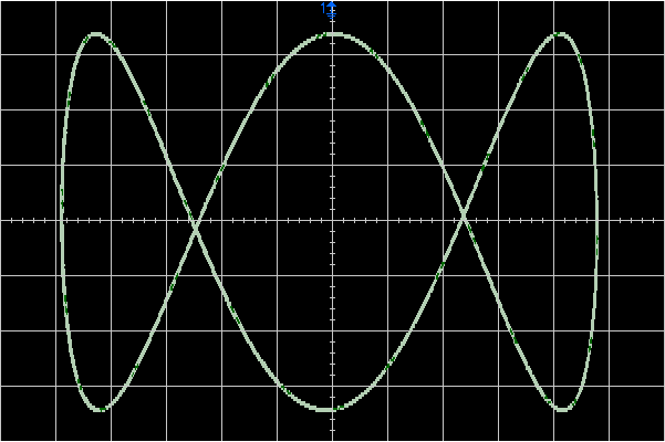
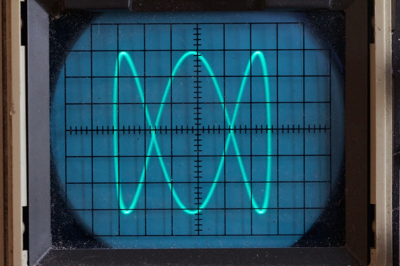
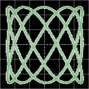
Perhaps the classic display is a Lissajous curve1 which you can easily generate2 with modern chips. In the example below,
\[ \begin{align} x(t) &= \sin(\omega t), \\\ y(t) &= \sin(3 \omega t + \phi), \end{align} \]where \(\phi \approx \pi / 2\).
We can plot this mathematically to see what we expect:

and then compare this with reality. The first plot below comes from an Agilent 350MHz digital storage scope, and is downloaded directly from the scope.3. The second is a photo of an old Trio cathode ray oscilloscope, and boasts a bandwidth of 15MHz.
More complicated signals
There is no reason why the signals need to be simple sinusoids. For example, when plotted, the signals below will generate a square:

Note: for clarity, the signals have been given vertical offsets.
If the period of the signal is \(\tau\) then note that,
\[ y(t) = x(t + \tau / 4). \]Or in other words, the signals are in quadrature.
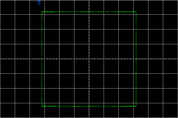
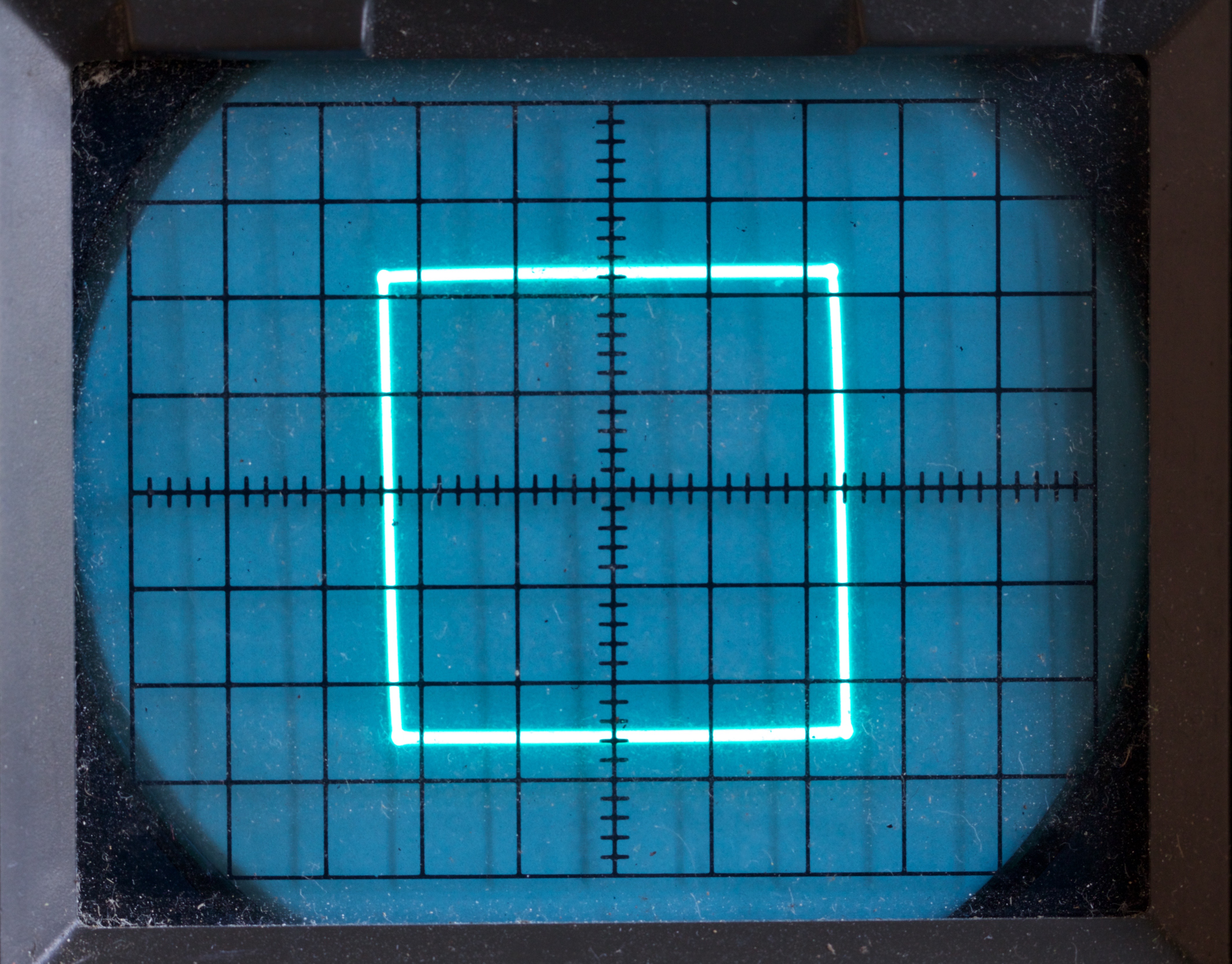
As expected these signals generate a nice square on the scope. We’ll begin with the DSO which was set to ‘high-resolution’ mode to reduce the noise. As a consequence the trace is almost too thin to see:
It is clearer on the old CRO:
Practical considerations
The signals above are simple and easy to reproduce accurately in the real world. In general this will not be true though. We know that some components are better characterized in the frequency domain, so it makes sense to seek insight by looking at our signals in frequency space too.
We are not going to do a full analysis: instead we will we ask what would happen if we filtered the signals with a perfect low-pass filter which simply blocks all signals above a certain frequency whilst leaving the others unchanged. This isn’t physically possible, but we hope that we will gain some insight into the ways that real signals will change in the real world. Implicit in this is the idea that the high-frequency components will suffer most.
We adopt a fairly casual approach to the Fourier transforms we need to get the frequency-space representation. In keeping with this, we will ignore constant multipliers and write \( \sim \) instead of \( = \).
A practical square
Let’s remind ourselves of the signal we used to draw the square:

Note that we can write it as the convolution of a set of delta functions \(f_{s}(t)\), and a finite motif \(f_{m}(t)\).


Note: strictly this convolution is for \(f(t) + 1\). We’ll return to this later.
The transform of an infinite set of delta functions is well known:4
\[ \begin{align} f_{s}(t) &= \sum_{j \in \mathbb{Z}} \delta(t - j \tau), \\\ \widetilde{f_{s}}(\omega) &\sim \sum_{j \in \mathbb{Z}} \delta(\omega - j \Omega), \end{align} \]where \(\Omega = 2\pi / \tau\).
To find the Fourier transform of the motif, \( f_m \), recall that differentiating in real-space is equivalent to multiplying by \( i \omega \) in frequency-space, and thus:
\[ \widetilde{f_{m}}(\omega) \sim \frac{1}{\omega^2} \widetilde{\frac{d^2 f_m}{dt^2}}. \]Differentiating the motif twice gives us four delta functions:


and Fourier transform of this is easy:
\[ \begin{align} \widetilde{\frac{d^2 f_m}{dt^2}} &= \exp(-\frac{3}{8} i \omega \tau) - \exp(-\frac{1}{8} i \omega \tau) - \exp( \frac{1}{8} i \omega \tau) + \exp( \frac{3}{8} i \omega \tau), \\\ &\sim \left(\cos \frac{\omega \tau}{8} - \cos \frac{3 \omega \tau}{8} \right). \end{align} \]Reassembling these parts, and recalling that convolution is real-space is equivalent to multiplication in frequency space, gives the frequency-space representation:
\[ \widetilde{f}(\omega) \sim \frac{1}{\omega^2} \times \left(\sum_{j \in \mathbb{Z}} \delta(\omega - j \Omega) \right) \times \left(\cos \frac{\omega \tau}{8} - \cos \frac{3 \omega \tau}{8} \right). \]We only need to evaluate the \( \cos \) terms at the discrete frequencies of the delta-functions, and happily these are easy to do: the pattern repeats after eight terms:
\[ \left( 0, +1, 0, -1, 0, -1 , 0, +1, ... \right) . \]Finally we can transform the delta-functions back to the time-domain to get our answer:
\[ f(t) = \frac{8 \sqrt{2}}{\pi^2} \left( \cos \Omega t - \frac{1}{9} \cos 3 \Omega t - \frac{1}{25} \cos 5 \Omega t + \frac{1}{49} \cos 7 \Omega t + \frac{1}{81} \cos 9 \Omega t - ... \right) , \]To get an intuitive feel, note that:
- we see a set of odd harmonics;
- the spectrum falls off as \(1/ \omega^2\);
- the sign of the harmonics flips every second term.
It’s a bit cheeky to include the correct scale term because we explicitly ignored such things above. Had we not though, the number would pop-out. Alternatively we can just sum the series for \(t = 0\) and assert \(f(0) = 1\).
In the fast and loose calculation above we ignored the details for the DC, \(\omega = 0\) case. Care is needed because we shifted the motif function to be continuous at \(t = \pm 1/2\) to simplify the calculation. Still, it suffices to note that the average value of \(f(t)\) is zero, and thus \(\widetilde{f}(0) = 0\) too. By contrast, a more careful analysis of the situation above would note that as \(\omega \rightarrow 0\), \(\widetilde{f_{m}}(\omega) / \omega^{2}\) does not go to zero: rather it has value \(4\) in the limit. I think this corresponds to the DC offset we applied to simplify the motif.
Having calculated the Fourier transform, let’s truncate it! Remember we hope this will give us some qualitative insight into the way that the signal might get degraded. The plot below shows the effect of keeping only the first three and five terms of the sum. As you can see it is still a reasonble square, but one that has been rounded off and gone a bit wobbly.

The check marks on the curves are evenly spaced in time, and happily they’ve remained roughly evenly spaced in distance too. This means the the curve will be traversed at roughly constant speed.
Discontinuities
Our experiments above might serve as a model for drawing shapes, at least shapes which can be drawn in one continuous stroke. However, sometimes we will have lift our pen from the paper and jump to a new location. So, we should also explore a simple model with discontinuities.
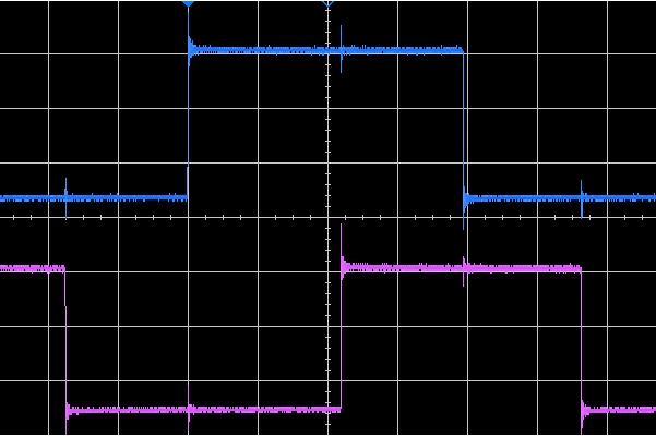
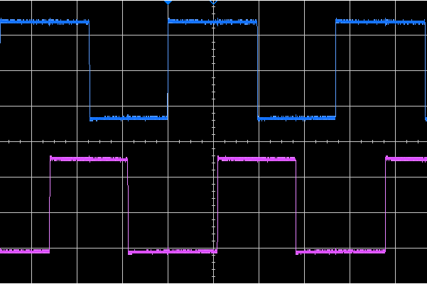
Perhaps the simplest thing we might examine is a set of dots, which we could conveniently place at the corners of a square. Such a pattern could be generated with a pair of quadrature square waves:

In an ideal world \(x\) and \(y\) change instantaneously between \(+1\) and \(-1\), so the vertical lines shown below shouldn’t really be there.
Let’s repeat the Fourier analysis above. The structural function is the same, but the motif \( g_m(t) \) is a simple top-hat with edges at \(\pm \tau / 4\). Again it is simpler to differentiate the function to get some delta-functions:
\[ \begin{align} \frac{dg_m}{dt} &\sim \delta(t + \tau/4) - \delta(t - \tau/4), \\\ \widetilde{g_m}(\omega) &\sim \frac{1}{\omega} \sin \frac{\omega \tau}{4}. \end{align} \]Evaluating this at the delta-functions:
\[ \widetilde{g_m}(\omega = j \Omega)_{j = 0,1,...} \sim (0,+1,0,-\frac{1}{3},0,+\frac{1}{5},...) \]and thus (again fettling the scale and DC component):
\[ g(t) = \frac{4}{\pi} \left( \cos \Omega t - \frac{1}{3} \cos 3 \Omega t + \frac{1}{5} \cos 5 \Omega t - \frac{1}{7} \cos 7 \Omega t + \frac{1}{9} \cos 9 \Omega t - ... \right). \]Let’s plot a truncated form of the series:

This time the results are rather different:
- At the corners of the square the trace now makes bold flourishes.
- Although the corners remain bright, the ‘edges’ of the ‘square’ are now drawn, albeit in a somewhat curved way. It might be better to think about limited slew-rates instead.
As you can see, it’s a pretty crude approximation of a square. Note that as we increase the number of terms in the series, the swirls also increase in number, and become move closer to the vertex: this is the classic Gibbs phenomenon.5
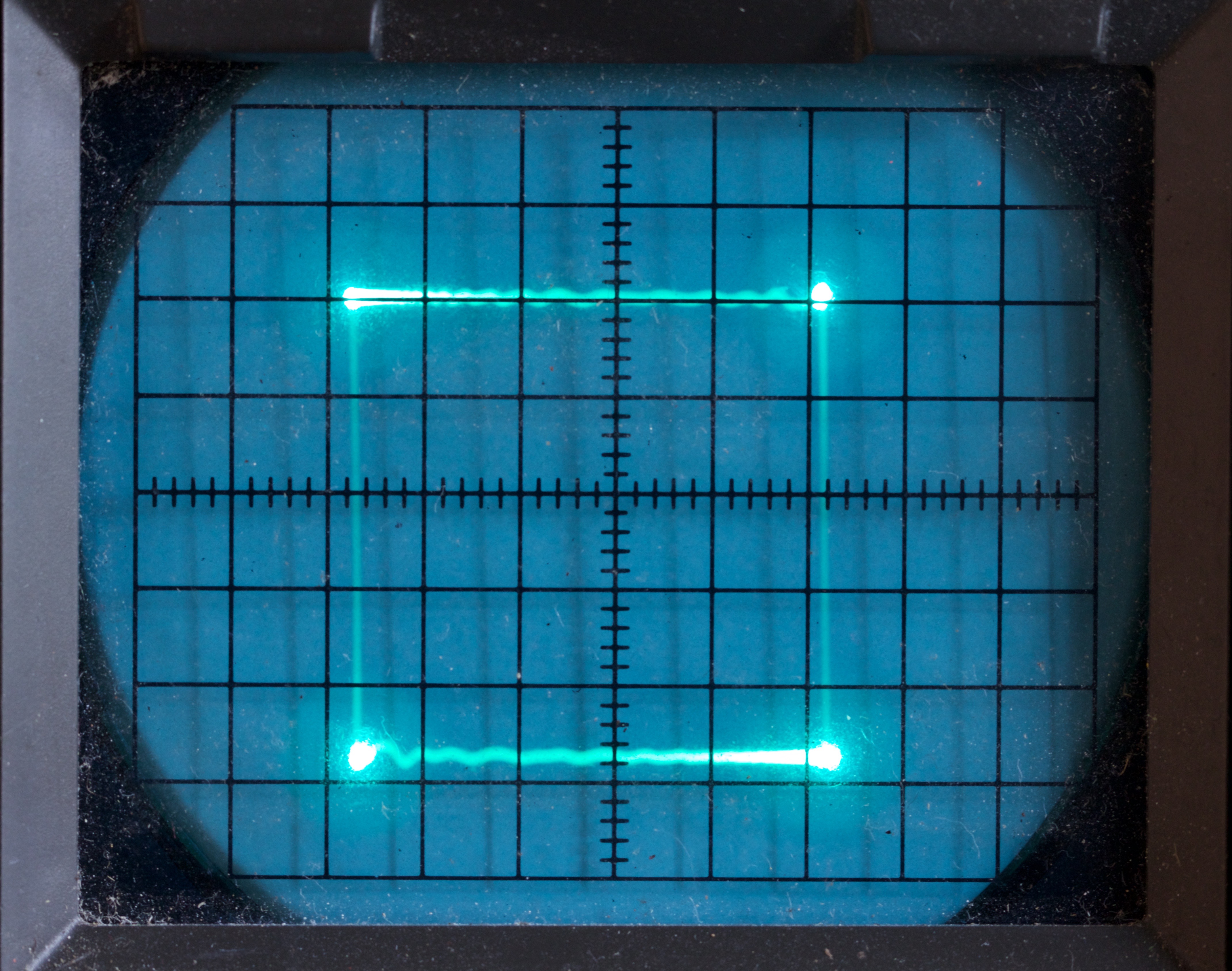
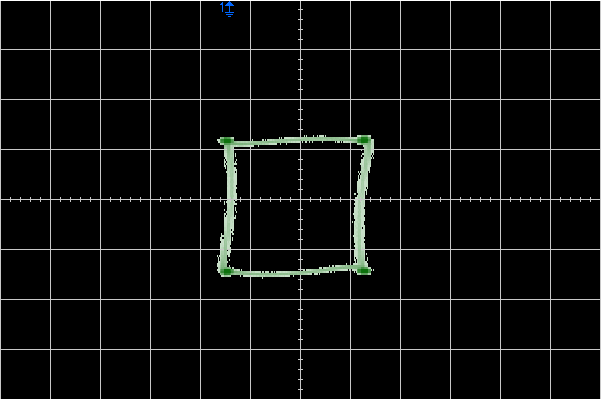
So much for theory, what does reality look like ? To find out I generated a couple of square waves with a frequency of about 135kHz with an Arduino and crudely connected them to the scopes. I deliberately took no care about the connections, so we might expect the high-frequency parts of the signals to suffer.
On the Trio, which quotes a 15MHz bandwidth things weren’t too bad. There is some ringing in the y-direction, but the main affect seems to be that we don’t just see the corner dots: the sides of the square are quite visible too.
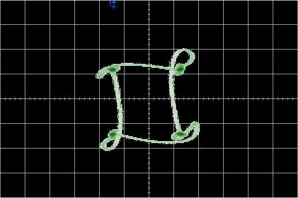
On the DSO though, we have 350MHz of bandwidth. In the time domain, we can see significant ringing on the edges of the square wave, and in XY-mode wild loops appear which seem qualitatively similar to those in the graph above.
Simply moving the leads around the bench is enough to change the pattern a bit: by poorly terminating the signals we see both bad effects and a strong sensitivity to unimportant details.
However, the DSO has a handy bandwidth-limit option which cuts the bandwidth down to 20MHz. With that engaged, we see something close to the Trio:
Conclusions
Although we’ve only considered very simple models, we might have some intuition about the ways that real-world signal degredation will affect XY plots.
- Continuous paths won’t be too badly affected: they might wobble a bit.
- Small discontinuous jumps will be replaced by thin traces between the end points, which won’t necessarily be straight.
- In more severe cases the jumps will lead to florid loops and whorls.
The key mathematical distinction is the rate at which the coefficients in the frequency-domain decay: \( 1 / \omega \) vs \( 1 / \omega^2 \).
Text
Squares get boring, but there is no need to stop here. Given a microcontroller with a couple of DACs, we can trace out arbitrary curves. A particular example of note is to trace out letters, turning the scope into a display device.
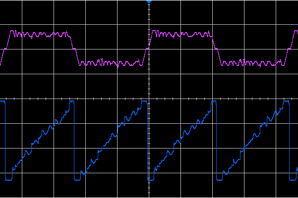
For example given these signals (X: blue, Y: purple):
We’d expect to see this:

The green line shows the strokes actually encoded in the signals, whilst the thinner red lines show the gaps between the strokes. The extra green strokes to the left and right of the text are designed to move the paths between the strokes well away from the text so that it’s more legible.
Both lines of text are written left-to-right, whilst the carriage return runs right-to-left along the thin red line. It is possible to see this basic form in the time-domain plot above. The top y-trace clearly shows the two lines of text and the transition between them, whilst the lower x-trace has a quasi-sawtooth shape.
Incidentally, I should say that the stroke arrangement algorithm could be improved: ‘t’ would be clearer if its cross-bar were stroked in the opposite direction, and there are probably better ways to handle ‘d’ and ‘p’ too. A job for another day!
Synthesizing the signal at a frame-rate of about 112Hz and displaying it on the CRO yields this:
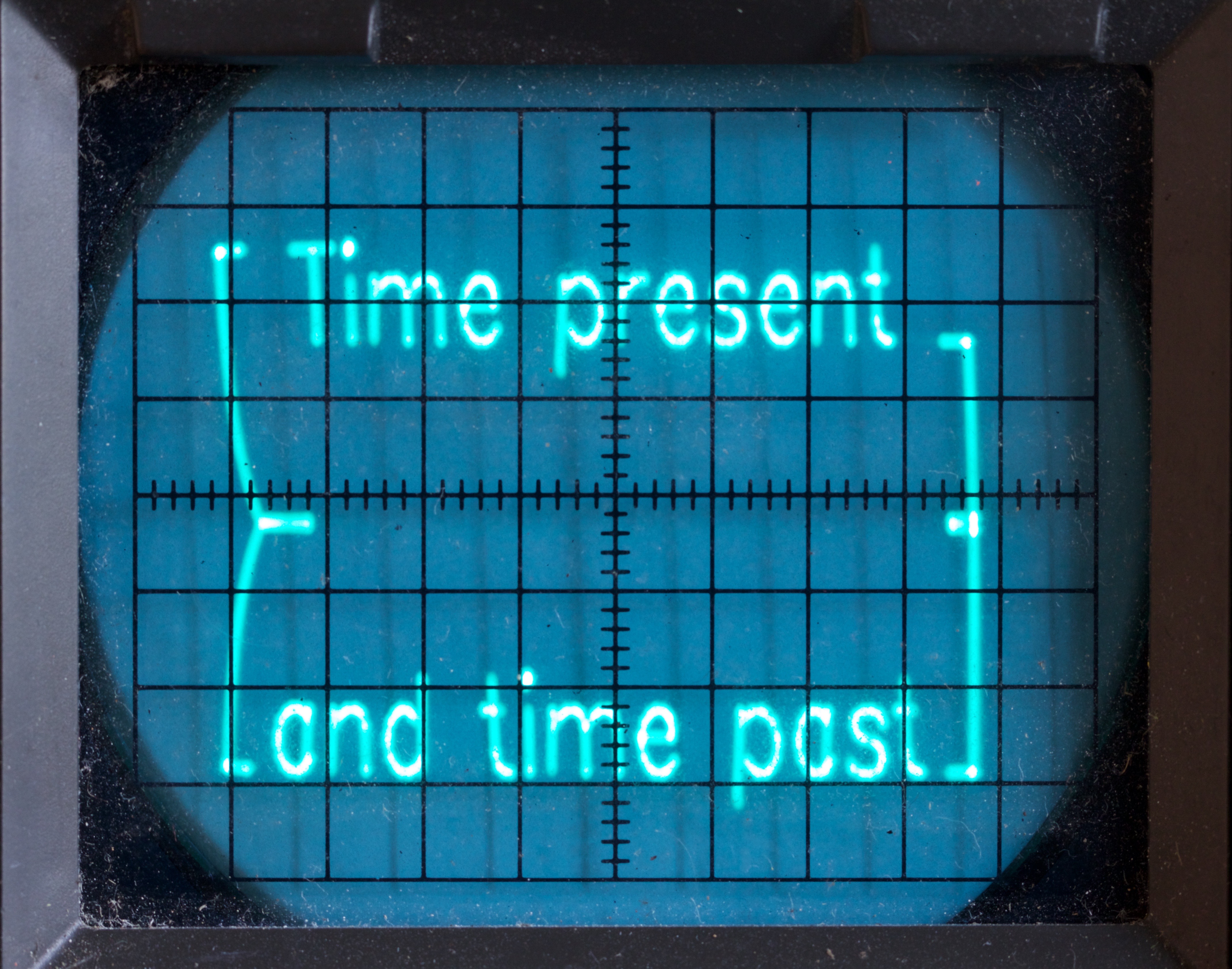
The main distortion is on the left-hand side, where it seems the beam doesn’t have enough time to sweep back before move away to the next line of text.
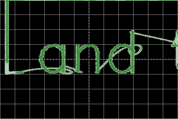
Switching to the DSO, we see a better display. It’s striking how close it is to the theoretical picture, which the main issue being the extra lines which join the discontinuous jumps: these mirror closely the red lines in the ideal plot.
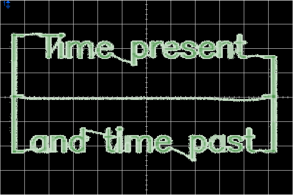
However, if we focus on the word ‘and’ it is possible to see whorls at the end of the jumps to the ‘a’ and ‘d’.
Although our simple square models seemed naive, they do seem to have given us some insight into the display of a real, complex, signal.
Movies
All the examples we’ve seen above have been static displays, but there’s no reason why this has to be the case.
A typical example is the ‘slipping’ Lissajous figure, where the frequencies of the two signals aren’t precisely locked. Here’s a movie made from frames downloaded from a digital storage scope, displaying sinusoids almost in the ratio \(3:5\).
However, many more sophisticated and artistic results are possible, just look on YouTube:
References
- 1. https://en.wikipedia.org/wiki/Lissajous_curve
- 2. ../06/ad9850-lissajous.html
- 3. ../06/scope-fun.html
- 4. https://en.wikipedia.org/wiki/Fourier_transform#Tables_of_important_Fourier_transforms
- 5. https://en.wikipedia.org/wiki/Gibbs_phenomenon
- 6. https://www.youtube.com/watch?v=rtR63-ecUNo
- 7. https://www.youtube.com/watch?v=qnL40CbuodU
- 8. https://www.youtube.com/watch?v=aMli33ornEU
![[ Atom Feed ]](../../atom.png "Atom Feed")